Is All This Health Data Helping Us, or Quietly Making Us Sick?
TL;DR
- Real-time health tracking has produced genuine clinical wins: AFib detection, overnight glucose alerts, continuous rhythm data that changes how clinicians diagnose.
- The same data, poorly framed, causes harm. Health anxiety, alert fatigue, and misplaced clinical concern are design failures, not edge cases.
- Unfiltered data is not empowerment. Users need interpretation, context, and reassurance, not a raw score with a red arrow at 6:45 a.m.
- The design question isn’t what to capture. It’s what to show, and how to frame it for a tired, anxious person without a medical degree.
- At the scale these products operate, “calm or harm” is a public health outcome. That is the actual design responsibility.
These days, it feels like everyone has a smartwatch, fitness tracker, or health app buzzing away with updates about how our body is doing. Heart rate, sleep, steps, hydration, glucose… you name it, there’s probably an app for it. For the product teams, designers, and engineers building these tools, that abundance comes with a real responsibility. Every score, badge, and notification is a design decision, and those decisions shape how millions of people feel about their bodies before they’ve even had breakfast. A reassuring nudge can help someone build a healthier habit. A poorly framed metric can send the same person down a 2 a.m. rabbit hole convinced something is wrong.
So, here’s the real question: just because we can show people every number, should we? Gathering health data has enormous value for spotting risks, improving care, and advancing science. The problem isn’t capturing the data. The problem is how we choose to present it and who we’re really serving when we do.
Health Tracking Has Real Clinical Wins
For many, real-time health tracking has been a genuine breakthrough. The Apple Watch flagging atrial fibrillation in someone who had no idea their heart was skipping. A continuous glucose monitor waking a parent at 3 a.m. because their diabetic child’s blood sugar is sliding toward dangerous territory. Pulse oximetry catching the slow oxygen drop of a post-COVID patient before they end up in the ER. Things that once went unnoticed now trigger alerts before they become emergencies.
Even for the generally healthy, numbers can motivate in useful ways. Walking more than usual? Slept better after cutting back on a late coffee? Resting heart rate trending down after a few weeks of training? That kind of instant feedback can turn a vague intention into a habit that actually sticks.
Clinicians benefit, too. A cardiologist reviewing two weeks of continuous rhythm data has a fundamentally different conversation than one relying on a 30-second EKG and a patient’s memory of “feeling weird sometime last Tuesday.” Richer data streams change workflows, sharpen diagnoses, and surface patterns no annual physical could catch.
The common thread in all of these wins? The data showed up at the right moment, in a form the person could act on. It told someone something useful they didn’t already know. That’s a very different thing from telling someone their sleep score dropped two points overnight.
Constant Monitoring Can Generate Anxiety, Not Insight
But there’s another side to this. Sometimes, all that constant monitoring starts to feel like… a bit much. Every tiny blip in heart rate or drop in sleep score can be taken out of context and suddenly seem like a red flag, even when it’s completely normal human variation.
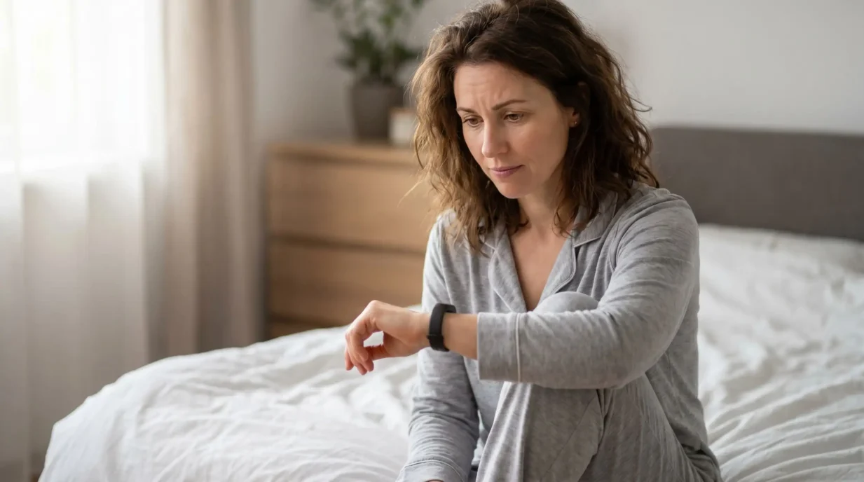
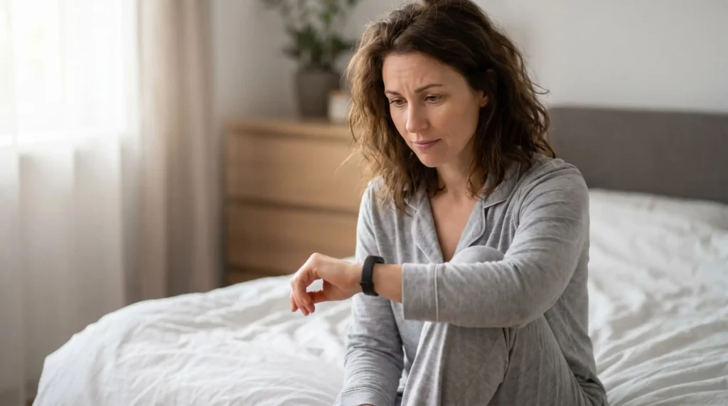
Picture a user who wakes up, reaches for their phone and sees a sleep score of 62 with a red downward arrow. They feel fine. They actually feel pretty rested. But the screen is telling them they had a “poor” night, that their HRV is “below baseline,” and that their recovery is “compromised.” By the time they’ve finished their coffee, they’ve gone from feeling fine to feeling fragile: not because their body changed, but because an interface told them to worry.
Multiply that by a few hundred mornings a year. This is how you get what’s sometimes called health anxiety or cyberchondria. It’s also how you get the more subtle harms: the otherwise healthy 34-year-old who books a cardiology appointment because their watch flagged three “irregular” readings during a workout. The new parent who can’t fall asleep because the baby monitor’s oxygen alert went off twice last week, both times false positives caused by a loose sock. The runner who stops trusting how their legs feel and starts deferring entirely to a “readiness score” generated by an algorithm that has never met them.
And then there’s the opposite failure mode: alert fatigue. When everything is flagged, nothing is. Users mute notifications, dismiss warnings reflexively, or abandon the device altogether, which means the one alert that actually matters, the AFib (atrial fibrillation) detection or the glucose crash, gets swiped away with the rest.
Sensors aren’t perfect either. A poorly fitting watch logs a heart rate of 180 while you’re sitting on the couch. A CGM warms up and reads 40 mg/dL when you’re actually fine. One glitch, and suddenly someone is doomscrolling at 2 a.m. wondering if they should drive to urgent care.
The danger isn’t the data itself. It’s the unfiltered firehose of data dumped on users without context, framing, or any sense of what actually warrants their attention.
Same Data, Different Frame, Different Outcome
The truth is people don’t need every number; what they need is meaningful, usable insight. We don’t thrive on raw measurements, especially in the morning before coffee. We thrive on interpretation, reassurance, and guidance.
Think back to that user staring at a 62 sleep score with a red downward arrow. The example below shows how the exact same sleep data can be framed in two dramatically different ways. On the top, the “data-dump” version is the one that sent them spiraling: scores, red flags, comparisons to an “optimal” range. On the bottom, the redesigned version delivers the same underlying information through context and reassurance: acknowledging a rough night without judgment, normalizing day-to-day variation, and offering a simple, optional next step.
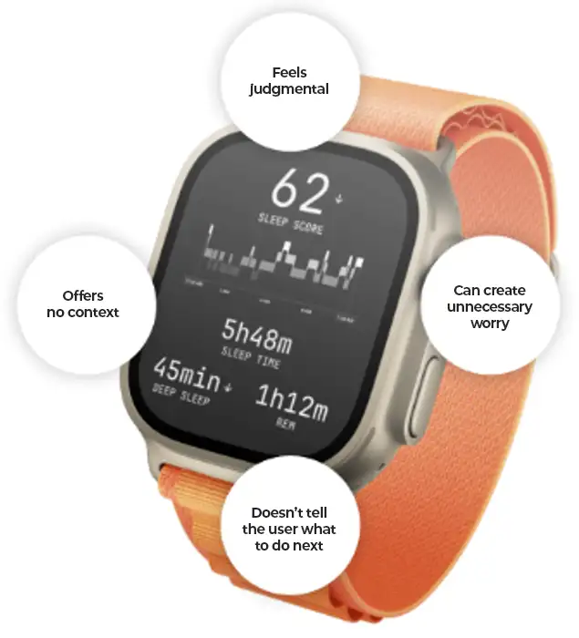
Look closely at what changed between the two versions. The underlying data is identical. What’s different is a series of small, deliberate design decisions: leading with a sentence instead of a score, replacing the red arrow with a trend line that shows the night in the context of the last two weeks, removing the comparison to “optimal” ranges that most users will never hit, and demoting the granular metrics to a secondary “see details” view for the people who actually want them. The “next step” suggestion is opt-in, not a guilt-trip.
Show Less, Guide More
The future of health tech isn’t about capturing less. It’s about showing it smarter.
Collect the full, minute, detailed picture in the background: for research, for clinicians, for the longitudinal models that will catch tomorrow’s problems. But when it comes to the user, deliver only what helps, in a way that encourages rather than intimidates.
For product teams, that means treating every metric on the screen as a decision that needs to earn its place. A few questions worth keeping on the wall:
- Does this number change what the user should do today? If not, why is it on the home screen?
- What’s the worst-case interpretation of this metric for an anxious user, and have we designed for that person, or only for the calm one?
- Are we showing this because it’s clinically meaningful, or because we can?
- When this metric is wrong (and it will be), how does the user recover their trust in the device?
This is the design responsibility, and it’s not a small one. Engineers and designers: usability isn’t decoration. It’s medicine. The way you frame the data can either calm or harm, and at the scale these products operate, “calm or harm” starts being a public health outcome.
Real-time health data has genuine potential to save lives, motivate healthier choices, and personalize care. But that potential is squandered if we confuse “more numbers” with “better health,” or “more alerts” with “more care.”
So, here’s the challenge: keep capturing everything but be ruthlessly intentional about what to show. Build tools that translate data into support, context, and encouragement,
Rodolfo Prata is a Senior UX Designer at StarFish Medical. Rodolfo studied Multimedia Design at Senac University (São Paulo, Brazil) and User Experience (UX) Design at the University of Toronto. Rodolfo is highly passionate about UX Design, always seeking innovative ways to improve user interactions for devices and services.
Images: Adobe Stock
Related Resources
Most medical devices were designed for clinical settings, not the patients and caregivers who increasingly rely on them at home. Here’s what good home-use device design actually requires.

How do you measure comfort in medical device design? Explore the tools, scales, and study design principles that turn a subjective experience into actionable design data.
Gathering health data has enormous value for spotting risks, improving care, and advancing science. The problem isn’t capturing the data. The problem is how we choose to present it and who we’re really serving when we do.
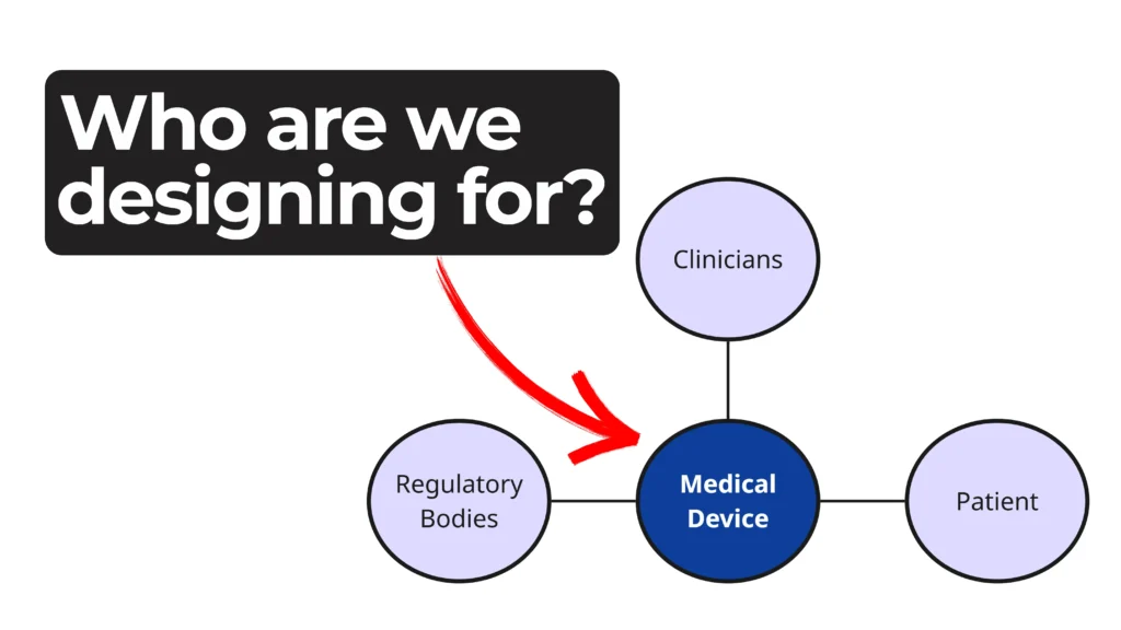
Every phase of a device’s life cycle involves different people with distinct needs—from clinicians and patients to service technicians and regulatory bodies.