Powerful Business Presentations: Tips for Visual Impact and Common Mistakes to Avoid
Crafting powerful business presentation materials requires a subtle balance between visual appeal and clearly written content. While it is essential to focus on the overarching theme, it is often the finer details that determine the success or failure of presentations created by Startups & Founders.
Seemingly minor mistakes—such as typos, inconsistent formatting, and overcrowded slides — are distracting and can undermine your credibility as a presenter and distract focus from your core message. Fortunately, with a little effort and attention to detail, these errors are entirely avoidable. The five tips listed below will help you avoid common mistakes and ensure that your presentation resonates from start to finish.
Keep it simple
Crowded slides overwhelm the audience, making it difficult to process information. Pare down written content to highlight key points. Use white space to improve focus and clarity for a balanced composition. Isolating an element with ample space around it, naturally draws viewers’ attention to it, increasing the impact.

Choose visual elements thoughtfully
Refrain from adding generic clip art or poor-quality images, just to fill space. Use unexpected elements such as shapes or bold fonts to emphasize important information and add visual interest. When using colour, have a consistent theme throughout your presentation for continuity. Alternatively, experiment with AI to create an original graphic that is tailored specifically to your message. Good graphics emphasize the key point of the slide — not distract from it.

Fonts matter
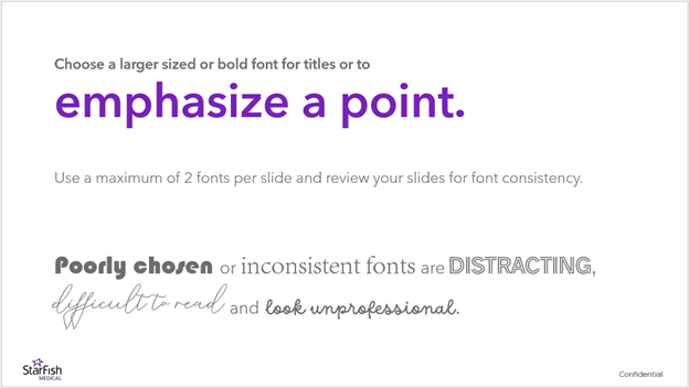
One of the most common and overlooked mistakes involves poorly chosen or inconsistent typefaces. Choose a maximum of two fonts — an easy-to-read font for general content and a more impactful, larger sized font for titles or highlighting information. Review your slides carefully for font consistency, just as you would for typos and grammatical errors. Avoid using informal, overly decorative, or illegible novelty fonts.
Make it personal
Aways keep your audience in mind when crafting content. If you want your presentation to resonate, it is important to research who you are speaking to. Understanding what matters to your audience enables you to tailor your communication accordingly. Customize your slides with relevant case examples, ask questions to solicit feedback or gauge understanding, and consider if the language and tone of your presentation is appropriate for your audience. If applicable, confirm that individual client names, titles, company, or product names, etc., are accurate and spelled correctly. Typos in general, can inadvertently convey a lack of respect for your subject and your audience.
Define your message
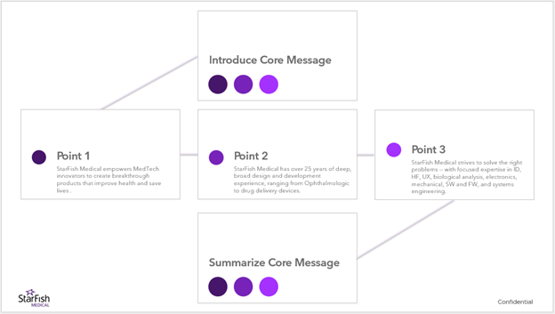
Slides that lack a clear message can lead to confusion and loss of audience engagement. Each slide should support the core message of your presentation and contribute to the overall narrative. Prepare an outline and limit individual slides to one key point, making it easier for the audience to focus, digest and retain the information being presented. Read content aloud and practice in front of others to ensure that your message comes across clearly.
The success or failure of creating powerful business presentations lies in the details. Take the time to refine your slides, clarify your content, and consider the unique needs of your audience to elevate your presentation and make sure your message connects.

Tara Acheson is the Proposal Writer for Business Development at StarFish Medical. She has supported the BD team for over 6 years, helping to create, refine and edit compelling written and visual content for client proposals and presentations.
Images: StarFish Medical
Discover Startups & Founders Benefits of Working With StarFish