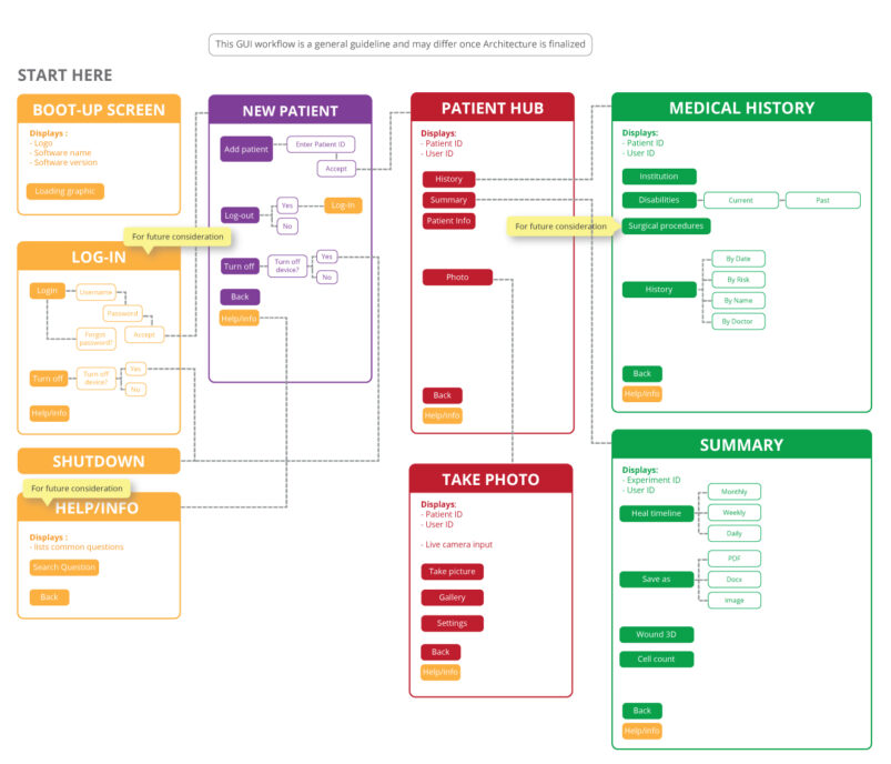
Here’s a common scene at some Medical Device UX Design and development companies: The product development phase is 90% complete and all that’s left is the ‘User Experience design’ of the app of a blood pressure monitor. The team comes up to the Industrial Designer for the first time and say “This is what it does and it needs to perform these functions, can you A. make this look pretty? And B. Can you do it quickly?”
And then they walk away.
The designer sits there awestruck, only to desperately call them back a second later to dump a bucketful of questions. Is it for the elderly? Is it mostly used by men or women? Where is it used? How is it used? Will it be used frequently?
In that scene we see 3 common and dire Medical Device UX Design mistakes:
- Mistaking User Interface design (UI Design) as User Experience Design (UX design)
- Not including the UX designer early on in product development phase
- Not allowing time for necessary research
So let’s get these 3 main misconceptions settled.
First things first: What exactly is UX design?
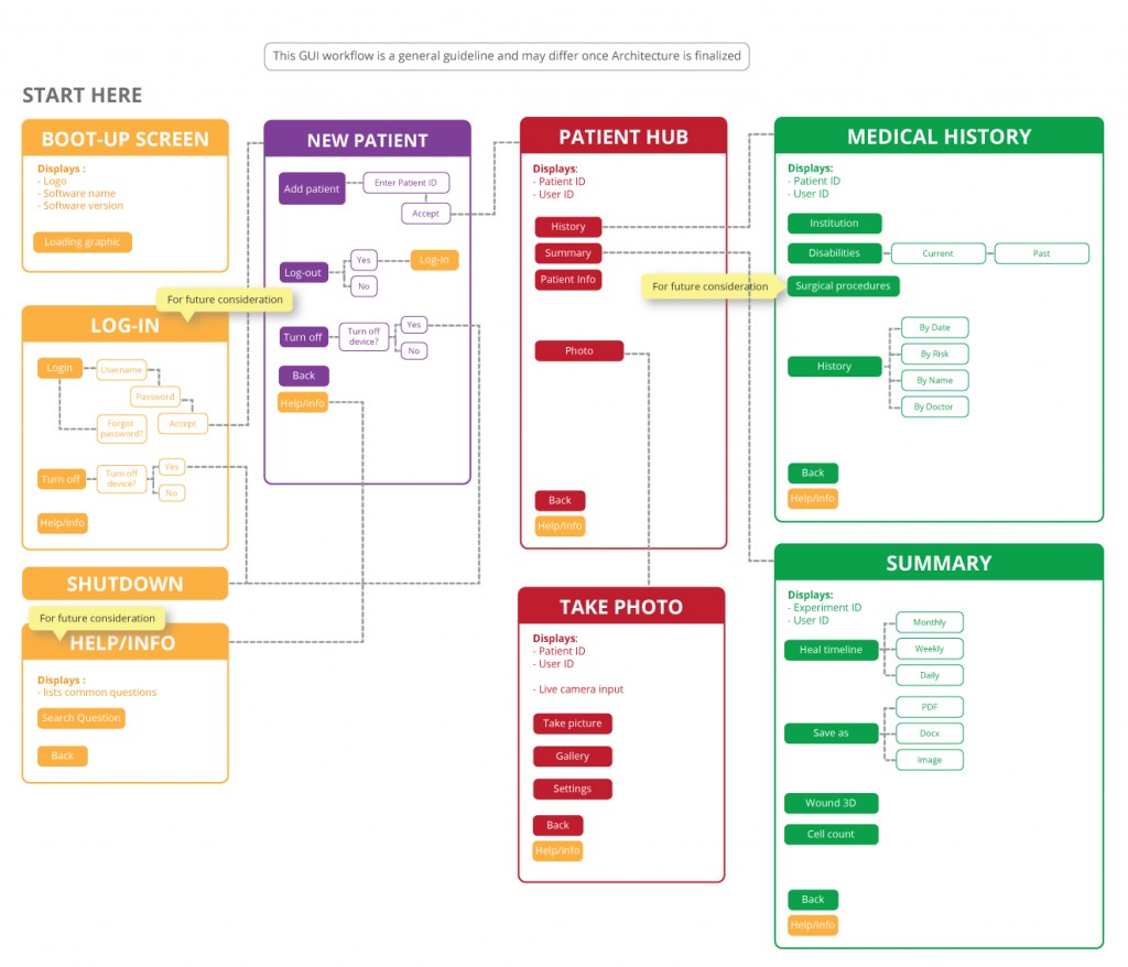
UX design is user-centered design. It is the use of cognitive science to improve the overall user interaction and satisfaction with a product. For example, observations show nurses like to use one hand to hold and comfort anxious patients. By applying that knowledge and designing a one-handed interface for nurses is UX design.
That being said…
UI Design is not UX Design
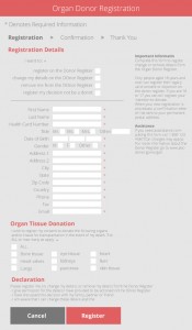
This is the most common misconception. UX design is an entire process whereas UI design is a step within the process. There are a lot of factors that make an experience with a product great but because a product is largely experienced by interacting with it, UI design is easily mistaken as UX design.
If we use the human body as an analogy. UX Design is the basic evolutionary survival decisions of the human body such as opposable thumbs, being bipedal, being omnivorous etc. UI Design is the aesthetic components of the human body such as whether or not you have thin or thick hands, hair or hairless legs, straight or crooked teeth, etc. UX designers create the skeletal system architecture and workflow that UI designers then use to create the skin or interface. That is why UI design is usually implemented nearer the end of the UX design process.
UX designers need to be included early on in the project
UX designers are the bridge between the users and the rest of the team. Because we can’t bring every user in the world to a meeting, it is our job to be a good representative. A common mistake is forgoing a key design aspect in favour of a technical detail. Having a UX designer at the very beginning of the project helps remind the team of the importance of users and the design of the overall experience. This will direct the overall product development strategy and allow for informed decisions before they are made concrete. Ignoring the UX designer until the very end means forcing the UX designer to produce what is asked for instead of what is needed and very often, what is asked for is not what is needed to produce a successful product.
Medical Device UX Design requires research
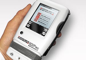
UX design revolves around a user-centered design. As such, UX designers are one parts designer and one parts researcher. We need to understand the user, and to do that we need to observe and interact with them. Unfortunately, often such research ends up being pricey, time consuming and tragically underestimated, leaving very little in the budget to do a proper job. UX Designers are then forced to blindly use their own perspectives– a terrible idea, especially in medical product design.
In the medical industry, users are very diverse and unique in comparison to your typical layman. Medtech users are often highly trained professionals with habits that they have developed unique to themselves. No doctor holds a scalpel the same way. Through observations and user interactions, UX designers are able to capture these small but substantive details to help drive the product development strategy. Medical devices are expensive, so when investing that sort of money on products, practitioners expect Apple and Google quality results that focus on designing the experience, and not just a product. The first steps towards achieving that? Research, research, research.
Medical Device UX Design is slowly being recognized as a way to differentiate companies and products from the market, however, some developers are still unsure on how to fully utilize it. More than just a buzzword, Medical Device UX Design is a whole new frontier. Hopefully this blog clarifies the 3 main misconceptions of UX design and gives you a higher understanding of what User Experience is really about.
Kimberly Nguyen is a former Industrial Designer at StarFish Medical. She works on a variety of Medical Device projects and prefers to start at the Product Definition phase. This is Kim’s first blog for StarFish. Look for more tips from Kim and her colleagues in our first Design and Human Factors newsletter issue in July.
Images: StarFish Medical
