Less is More When Designing Medical Devices
One of the goals of good medical device design is to turn a lot of complicated science and engineering into a simple package that’s easy to use and understand. To help achieve this goal, remember that less is more when designing user interfaces, device enclosures, and instructions.
Architect and furniture designer Ludwig Mies Van Der Rohe first used the phrase “less is more” in the context of design back in 1947. Even several decades later the phrase rings true in many areas of design and especially in the field of medical devices.
GUI Design
Over the last decade, minimalism has become an important trend in user interface design and for good reason. Reducing clutter in a GUI allows users to focus on what’s important. Fewer choices drive faster decision making by clinicians, which is important when a patient’s life is on the line. When fast decision making is required, keep in mind Hick’s Law: increasing the number of choices will increase a user’s decision making time logarithmically. In a user interface where quick decision making is critical, consider hiding less important features in a menu.
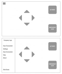
In the example GUI shown, less important options are hidden away in a menu. This allows the clinician to complete time sensitive tasks quickly.
Use of Color
Color is an important tool to guide users. Applying it sparingly can greatly improve the usability of your system. Color can be used to highlight important buttons or draw the eye to important information on screen. If too much color is applied to unimportant elements, a user will have a harder time knowing what they should be focusing on.
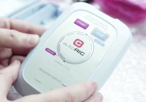
Color is a valuable tool in both software and hardware design. Color and contrast can be used as a tool to guide the user to important areas of a medical device. Image courtesy of CellAegis Devices.
Cleanability
Minimalism as an aesthetic trend has become quite popular in recent years. Aside from looking good, minimalism is also conducive to good medical device enclosure design.
Medical devices in generally tend to have white enclosures. In the operating room, this can help create a more soothing environment for clinicians. More importantly a device with a white enclosure is much easier to clean especially when blood is involved.
Simple minimalistic shapes also mean that there are fewer crevices for dirt and contaminants to hide in.
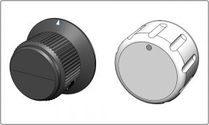
The dark color of the black knob (left) makes it hard to determine if it’s clean or not. Furthermore it has sharp inside corners that can trap contaminants. A lighter color and simpler shapes (right) improves cleanability and provides a more up to date look.
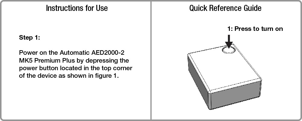
IFUs and QRGs
Medical device Instructions for use (IFUs) and quick reference guides (QRGs) are often written by technical people. This can result in instructions that are technically worded and hard to understand – especially for end users with a lower reading level. Reducing wordiness makes information accessible to both technical and non-technical end users alike.
When applying the “less is more” philosophy to instructions, it’s helpful to remember rules 2 and 3 of George Orwell’s 5 Rules for Effective Writing. Rule 2: Never use a long word where a short one will do. Rule 3: If it is possible to cut a word out, always cut it out.
IFUs often need to meet requirements that make them inherently wordy. QRGs on the other hand are generally less limited by those requirements and provide lots of opportunity to create a simple and elegant set of instructions.
Now that you’ve read my four reasons why less is more when designing medical devices, I would love to hear and see examples from readers.

Tim Park is a StarFish Medical Industrial Designer based in our Toronto office. His experience includes consumer and medical device products. Clutter is not in his vocabulary.
Images: StarFish Medical