Medical Device UX design process – Design & Testing
This is where the fun stuff starts. Unlike part 1 of this 3 part series, The user experience UX design process for medical devices: research, where we have strict guidelines, part 2 covers areas that are not as restricted.
In this stage, you’ve gathered all the data accumulated from your research and are finally putting it to good use. You’re beginning to design and conceptualize, but aren’t imagining what shade of red you’re going to make the homepage yet. In other words, you are designing how it works. So how do you start?
UX design process: Information architecture
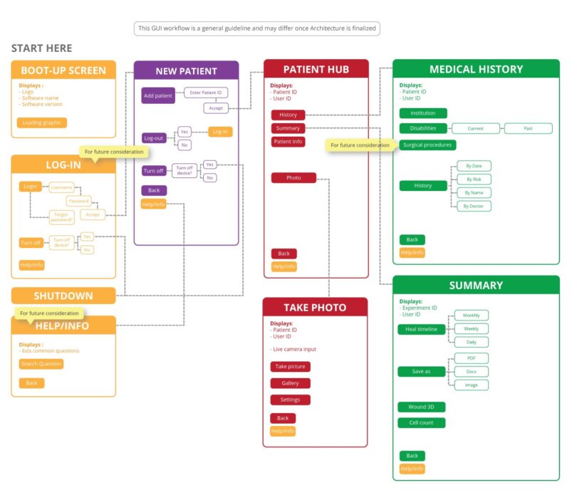
The information architecture is a diagram that describes the organization and structure of functions and content in a manner that’s intuitive to your users so they may navigate your device successfully. Using the human body as an analogy, the information architecture details how you’ll be able to wave your hand. First you raise your arm, then position your hand, then straighten fingers and finally wave your arm and your goal is complete. Sounds simple, but the information architecture details every possible goal and there can be many different paths to achieve each goal. These functions are established from the product requirements and risk analysis document started in Part 1.
Now it’s time to include those requirements in workflows and organize those workflows so they make sense. You start by categorizing functions and sub-functions in pages. These pages are the screens that the user will see, such as the Login Page. Once you have all your functions categorized in pages, you begin organizing them further into a hierarchy. This helps identify which pages or functions users will need to access easily and which can be placed in the background.
Going back to concepts from Part 1: Research, you can perform a card sorting exercise where users are given a deck of cards of categories you’ve created and asked to connect the categories or place them in a hierarchy themselves. This is useful in determining how people will interact with the information and should be incorporated into the information architecture.
Once you’ve determined your pages and placed them in a hierarchy, you can map out the route between each page. The goal is to direct users to their destination as quickly and easily as possible. There’s a rule called the Three-Click Rule. All important content should be accessible in 3 clicks/taps or less. The more pages that users have to go through, the less satisfied they will be in the end.
Remember the use specifications, use scenarios and user profiles you created back in Part 1? Always go back to those documents to remind yourself who you’re designing for and why. It’s very easy to forget the ultimate goal of the product and design something completely out of scope. For example, it’s easy to include the social media trend of sharing your status at every opportunity, however, most people using a blood pressure monitor do not want to boast or advertise their hypertension to their friends and family.
UX design process: Wireframing

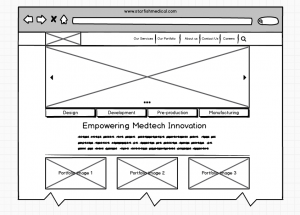
Whereas the information architecture organizes how each page connects with the others, wireframes are used to organize the content within each page in layouts and represent the connections and hierarchy described in the information architecture. Applications used to create wireframes allow designers to represent these connections screen for screen. These wireframe screens can then be used as an initial prototype to perform a cognitive walk through to show to Key Opinion Leaders (KOLs) or be used in usability testing.
When creating wireframes, remember that they should only add enough detail to represent the workflow and not provide any graphical elements unrelated to the effectiveness of the workflow. Therefore defining the font type, colour choice or icons should not be part of the wireframes. Designers purposely design wireframes to be ugly so that when shared with clients or developers, it is clear that the graphical elements are not the point of discussion. Instead, the focus is the overall usability.
Another thing to remember is to remain consistent in your layout in order to remain cohesive in your design. If each screen within your workflow is different, then users can be confused as to where to find functions. Although I mentioned above that following trends can lead to unnecessary functions, some trends become standards that users are familiar with and may look for. Not following those standards can lead to use error. An example of a current trend is signing in with your Google or Facebook account. Users might be used to the 1 click/tap sign-in process. Without it, they may feel like the workflow is lacking.
UX design process: Formative Evaluation
A formative evaluation is performed to explore your device’s “strengths, weaknesses, and unanticipated use errors”. It is generally done iteratively through the design process. This can include a simple cognitive walk through, KOL reviews, or usability tests. The criteria you choose to pass your formative evaluation should be pre-determined in your formative evaluation plan. This is where the wireframes come in handy. Once you’ve performed your evaluation, you can easily update the wireframes and perform another evaluation until the evaluation results are acceptable.
Are you wondering when you can start deciding which shade of red your homepage can be? Wait for part 3 of this series where we’ll discuss designing high fidelity mock-ups to aid in the implementation of your designs.
Kimberly Nguyen is a Jr. Industrial Designer at StarFish Medical. She works on a variety of Medical Device projects and prefers to start at the Product Definition phase. Look for more tips from Kim and her colleagues in our Design and Human Factors newsletter issue.
Illustrations: StarFish Medical