Get the most out of medical device user testing
Do you know the most overlooked step in creating a useful medical device?
It might sound surprising, but if we were to look at a graveyard of failed products, more often than not they fail because, while they deliver their promise, they fail the user. Do not underestimate how critical it is to seek user feedback in the design process. User feedback is essential for making educated design decisions.
Usefulness isn’t just about features and functionality. It is about designing a product for the whole human being; which encompasses emotional, psychological and physical aspects.
What is the best practice for getting user feedback? As an intern at StarFish Medical, I recently participated in a laser eye surgery device usability study for our client, STRŌMA Medical. In this post, I share how to get the most out of user testing and medical devices by drawing upon my experience working with the ID/HF team on the medical device usability testing study.
Ask Open-Ended Questions and Dig Deeper

Ask open-ended questions to understand the “why” behind a user’s experience with your device.
It is important to go into the usability session with a list of questions that are open-ended in nature. Use open-ended questions and follow-up questions to learn about a user’s experience with something. For example, you’d want to know if someone experiences discomfort when holding something in their hands, and you also want to discover why.
When you treat the interviews more like a conversation and are open to digging deeper into what you are discussing, you can learn much more about people and their experiences. This is a fantastic opportunity to find areas for innovation.
For example, in my thesis, I discovered that some analogous devices worked well but, children were afraid of them. As a result, they would not use the devices. When conducting my usability testing, I would never have asked questions like, “Are kids afraid of the device” or “Do kids scream and cry when using the device”? These were learnings that I would not have anticipated, that turned out to be one of the project’s most important findings.
By asking follow-up questions and letting conversations flow, I discovered an extremely negative user experience with an analogous device, and thus an excellent opportunity for innovation.
Avoid Leading Questions
There is a substantial difference between:
“Where do you want the button?”
And
“If you wanted to turn this device on/off, how would you want to do that?”
If you ask someone where they want a button, they will assume it is a button. In fact, it could be a switch, a lever, a knob, or a unicorn horn. Asking “where do you want the button” infers the solution is a button. It pushes users towards a response that discounts all other possible scenarios.
A unicorn horn could be a great on/off solution, but the user never knew it was an option. When you avoid leading questions, you avoid assumptions and allow anything and everything to be a possibility.
Be Aware of Your Own Biases

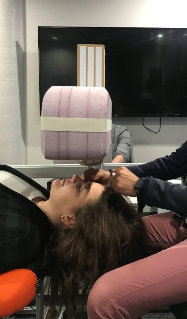
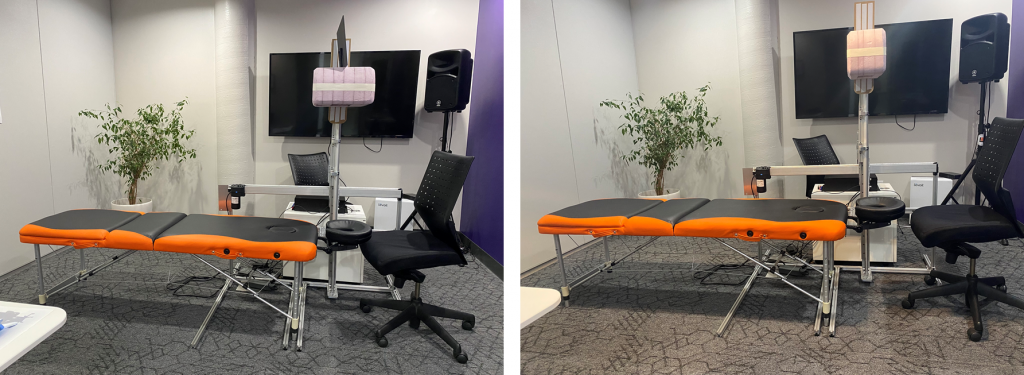
Recently we completed a formative evaluation for a system that includes an overhead gantry which presents a volume above the patient’s head and descends during the procedure. During Usability testing, we tested two different-sized gantry heads to determine which size end users would prefer. Participants were asked to lie underneath the heads and describe their perceptions of each version. We did not tell users which size was being tested.

I had anticipated that participants would prefer a smaller gantry head as a larger head might feel claustrophobic. To my surprise, the majority of participants preferred the larger gantry head. They explained the larger head blocked off the rest of the room from their visual field, which was “comforting”.
Often designers either discount concepts before they even hit the page or have a false sense of confidence about their concept based on their own assumptions. Recognizing our own unconscious biases and assumptions around the size of the gantry, we knew this factor needed to be tested. As a result, the device design is more comfortable for users.
Enjoy it
If you’re conducting user testing, you probably worked on the design, or it’s your design. If you are interested in, and excited about, the process, your participants will too. Take a deep breath, remember why you are doing it, and enjoy.
Good luck!
Emily Hayhurst is an Industrial Design Intern at StarFish Medical who graduated with Honors from the Industrial Design program at Sheridan College. In her graduating year, Emily won several awards for design thinking and design for manufacturing, and has a passion for human factors design.
Images: StarFish Medical
