
Sensory Design for Medical Devices
The medical devices in the masthead above have vastly different purposes. One thing that’s common is they all have some combination of sensory aspects. Sensory design uses affordances (perception of design features intuitively suggesting a functional task) and semantics (conveying meaning and information about the product’s use and function through sensory cues). Both can be communicated through our five senses with the most common being visual, tactile and auditory.
Through intentional industrial design, the use of a product can be conveyed through physical (and sometimes digital) design elements like deliberate color, material, and finishes (CMF) to create an intuitive device that reduces user error.
Sensory design considerations are especially important in medical devices, they can ease the cognitive load when interacting with the device. Unlike consumer products, a delay in executing a specific medical device function can result in potentially life-threatening outcomes, as evident in examples that are discussed later in this article.
Principles of Sensory Design
Good design has rules. One result of good design is proper and effective use of the product. The following examples highlight 5 key design applications when implementing sensory design in medical devices.
Sensory Features by User Group
A combination of sensory designs aids how efficiently people use devices. Even if the purpose is the same, the types of sensory outputs can vary by the types of users interacting with the device. There is always a trade-off to be made when considering the user group and ease of device interaction.
The design of automated external defibrillators (AEDs) in public areas use perception-action link (coordination between what someone perceives and what they do) and learnability (the ease of properly using a product without training) to aid prompt understanding of the device by untrained individuals during critical conditions. This helps users intuitively know what to do with the device without formal training.
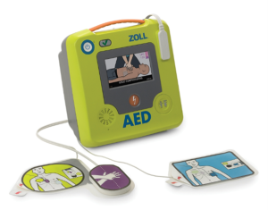
The green public access AED has a bright orange handle and shock button aligned symmetrically to indicate parts of the device users should interact with. A large display with a front-facing speaker visually & audibly conveys basic information of the device operation and brightly colored pads along with simple graphics prominently indicate where to place it on the user’s body. It is an intentional choice to limit the cognitive load on AEDs for public use even if that means fewer bioindicators will be available.
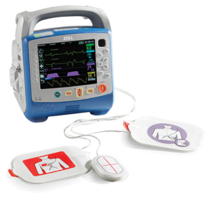
The AED for EMS use has a plethora of additional information and corresponding physical interfaces that are useful for trained EMS personnel. The large ergonomic handle signifies its importance of mobility while the colored buttons stand out as more frequently used features amongst its other capabilities.
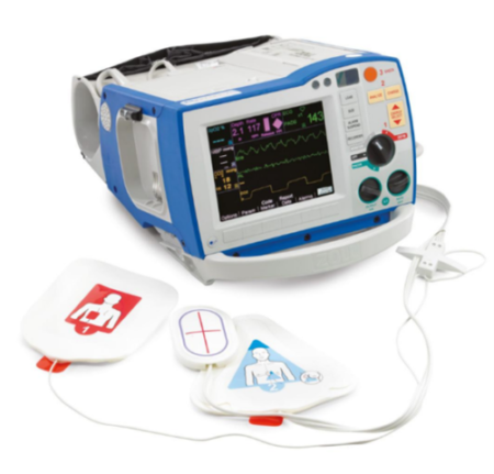
On the hospital-use AED, the shock button is much smaller, and interfaces allow a knowledgeable, educated user to fine tune the current. There are limited obvious sensory cues for proper use of the device because the intended users are well trained professionals.
Perception Variations
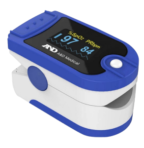
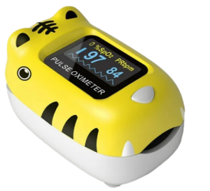
Consumer facing medical products tend to place an importance on aesthetic variations to target the right demographic. Although the internal functions remain the same, how the user perceives the device can influence their emotional state which can then influence compliance and how effectively they interact with the product. The three at-home pulse oximeters below have similar overall form and function, but the perceived values are different. An effective way to determine the perception users may have of the product is by using key words to describe the look and comparing them with its variants.
The white and blue device is clear on where to insert the finger for measurements, textured top end to open/close the device and each visual indication seems to be of use. This is an ideal variant to be recommended by healthcare professionals due to its utility and simple visual elements.
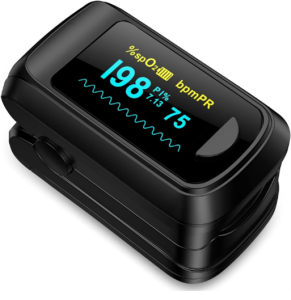
The all-black variant looks cool, but its trade-offs are physical and visual markers of how to use the device intuitively. This will most likely be used by individuals that cares more about looks and are relatively confident in operating the device.
The yellow animal-looking variant is geared towards pediatric use because of the fun, child-like elements such the animal ‘opening its mouth’ so the finger can be inserted for measurements.
Desirable Perfections and Undesirable Imperfections
How a product looks brand new is different from how it looks after many uses. The physical changes can either be desirable (patina of leather for example) or undesirable (rust on metal). For most medical devices, products are intended to look as if they are always in pristine condition even if they are a few years old. This conveys the message that the device is clean, reliable and works as new.
During pelvic exams, a speculum is used to spread apart and examine the internal cavity of the female pelvic region. Historically, women perceived the speculum to be an intimidating device used in uncomfortable medical examinations. Even in modern times, pelvic exams can be an anxiety inducing process for many patients [1].

When looking at the metal speculum, it can be seen how the design and material used contribute to the patient’s notion. A full body of metal with exposed screws looks more like a workshop tool than a comfortable, inviting medical device. Visible scratches on the reflective surface and yellowing of the screw edges may lead patients to believe they are due to repetitive harsh use on patients, even if that’s not true. Metal is also cold to the touch, so when any part of the patient’s body contacts the device, there is an unpleasant sensation which warrants the negative connotations patients have with this device.
This plastic speculum is a currently used variation. The warm colored plastic along with hidden tightening mechanism makes it hard for wear signs to show. When inserted, the plastic has no surprising temperature differences, and the three thin blades reduce the surface area for cavity contact.
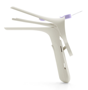
Figure 8: Modern plastic speculum Image Source: Nella
Visual Detailing
Even with highly trained healthcare professionals, implementing sensory cues into devices makes the workflow more efficient.
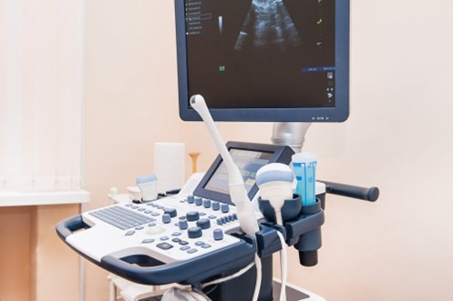
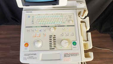
Knobology is a term used in ultrasonography to refer to the understanding of the numerous knobs and buttons on an ultrasound machine. Sonographers are well acquainted with the controls of ultrasound devices, but the visual layout, size, colour and tactile feel of the interfaces create a sensorial hierarchy reducing the cognitive load required to navigate the interface. This allows the user to keep their focus on patients rather than navigating the machine.
Looking at the visual detailing of the dashboard above, some controls are symmetric while others are not, organized by common tasks during ultrasounds such as depth, gain, focus, and mode control to name a few. Frequently used controls have darker colored knobs, while controls that require finer tuning are larger with more prominent ridges for precise tuning.
If all the colors, size, and spacing of the controls are mostly similar or symmetric, such as the ultrasound machine pictured above, it would be quite challenging to find the appropriate button or knob from a simple glance and would require the user to divert attention away from the patient.
Sensory Dominance
Quite often, medical devices have different functions depending on the user type and its use. This results in a variety of sensory aspects and attention of those interacting with the device. Color and form are commonly used to signify important areas throughout the device.

The Stryker ambulance stretcher shown above has various operations. When folded down and stowed inside the ambulance (left), the yellow handles along the top frame are the main visible affordance, making it easy for EMS to quickly remove it to retrieve a patient. The red locks are contrasted from the black base to easily identify where to unlock the wheels. During patient transport, the stretcher is expanded, revealing the bright yellow legs visible only from the sides so bystanders can notice it and make way while not impeding the visual load of the EMS moving the stretcher from the front and back. The black bed and side guards are intentionally unnoticeable as this can detract from the patient, or objects placed in the center.
Consumer Facing Unified Products
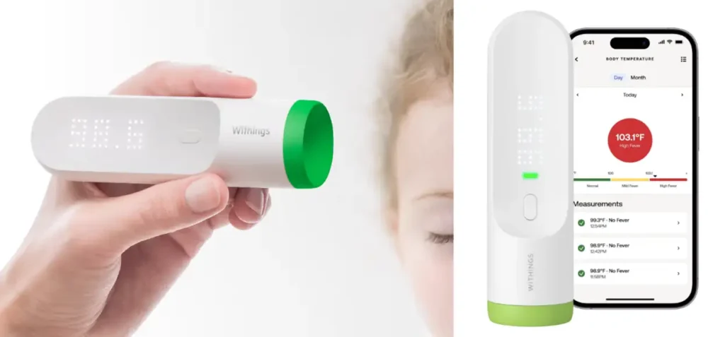
The Withings Thermo is a smart, no-contact thermometer. It features a recording history of multiple users along with a host of other features. Looking and functioning differently than a normal analog thermometer, the new features will be of no use if the user in unable to use the product correctly.


The compositional theory of form by Reed Kostellow shows the visual similarities of an analog mercury thermometer with the Withings Thermo. This familiarity simplifies using the device. Most products have 3 distinct splits of structural elements. The dominant visual detail for both the thermometers is the tip measuring the temperature on the body. The subdominant detail is the temperature gauge or LED readout. The subordinate feature is the clear or white plastic case where users will hold the device, both thermometers are designed so a plain canvas houses the more important areas. Advancements in technologies naturally lead to newer medical device designs. It’s important to keep consistent sensory cues in place to help users adapt to the change.
Balancing Sensory Design with Brand Identity
While it can be simple to add a whole host of sensory design elements to make interaction easier for the users, there is more complexity involved in choosing the right sensory cues and making sure they align with the brand. Medical devices are typically distributed under brands with firm branding guidelines, it is essential to fit sensory designs within those guidelines. The identity of many brands are also a result of consistent sensory designs such as distinctive CMF or form to signify important features of the device.
Hospital Facing Unified Products
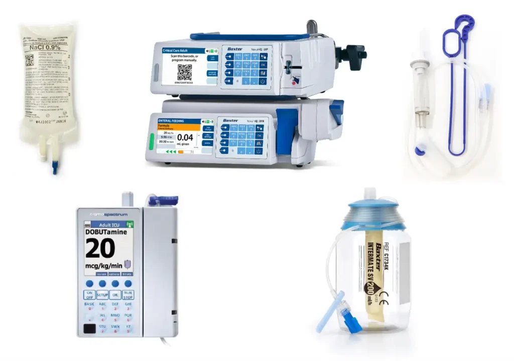
Image Source: Baxter
Summary
Designing with Sensory Aspects in mind makes medical devices better for all users. Sensory design can be overlooked but is an integral part of designing intuitive medical devices for both patients and healthcare professionals. From untrained patients innately knowing how to use products through universal design affordances, to reducing the cognitive load of professionals interacting with complex machines through visual and tactile semantics, sensory aspects of medical devices play an important role in the healthcare industry.
In hospitals, it is paramount to have all devices clean with mostly utility-driven designs. Baxter, a manufacturer of hospital products geared towards kidney diseases and other acute medical conditions, has a unified line of devices that have dark blue textured parts to indicate important touch points, contrasted from the cool white or clear plastics which indicate work (or do not touch) areas. Healthcare professionals unconsciously pay attention to the highlighted areas when interacting with any of Baxter’s products. This reduces the cognitive load needed to understand the use of each device.
Devang Ghosh is an Industrial Design Intern at StarFish Medical who currently attends Carleton University’s School of Industrial Design. Devang won a few awards for his student design projects and is interested in integrating research and iterative prototyping to holistically solve design problems.