Medical Device UX Design process: 4 considerations for optimal User Interface usability
A good User Interface (UI) improves usability for any medical device UX Design. Even if your device has all the needed functions and features and your workflow is proven based upon research and testing, the UX Design that users interact with is where they really gauge the experience of the device. For medical devices, documenting the reasoning behind your design will help it pass through your team and regulatory submissions and approvals.
In part 1 and 2 of this 3 part blog series, The user experience (UX) design process for medical devices: research and Medical Device UX design process – Design & Testing, I outlined the research, design, and user testing of the UX design process, but withheld comment on designing the look and feel of the user interface. In this blog, I’ll help you determine which shade of red to use for your user interface.
UX Design Ergonomics and Anthropometric data
A rough layout of your interface should have already been sketched out in your wireframes. It’s time to specify the sizes of the buttons, menus, fonts, windows etc. These sizes should always be based on anthropometric and ergonomics data. For example, if the index finger breadth size of the 95th percentile male is approximately 20 mm, then the target size of your button should be as large as or larger than 20×20 mm (converts to 57 pixels). Anything smaller will decrease accuracy and speed, and increase the risk of touch errors and use time. However, for medical devices, users may be wearing gloves. For touch screens, that increases their finger size and decreases the probability of the display registering the touch. Developers have mitigated this issue by increasing the size of the touch points and the sensitivity of the display. This mitigation runs the risk of users lightly brushing the screen and accidentally activating a button. User testing will help balance out those disadvantages
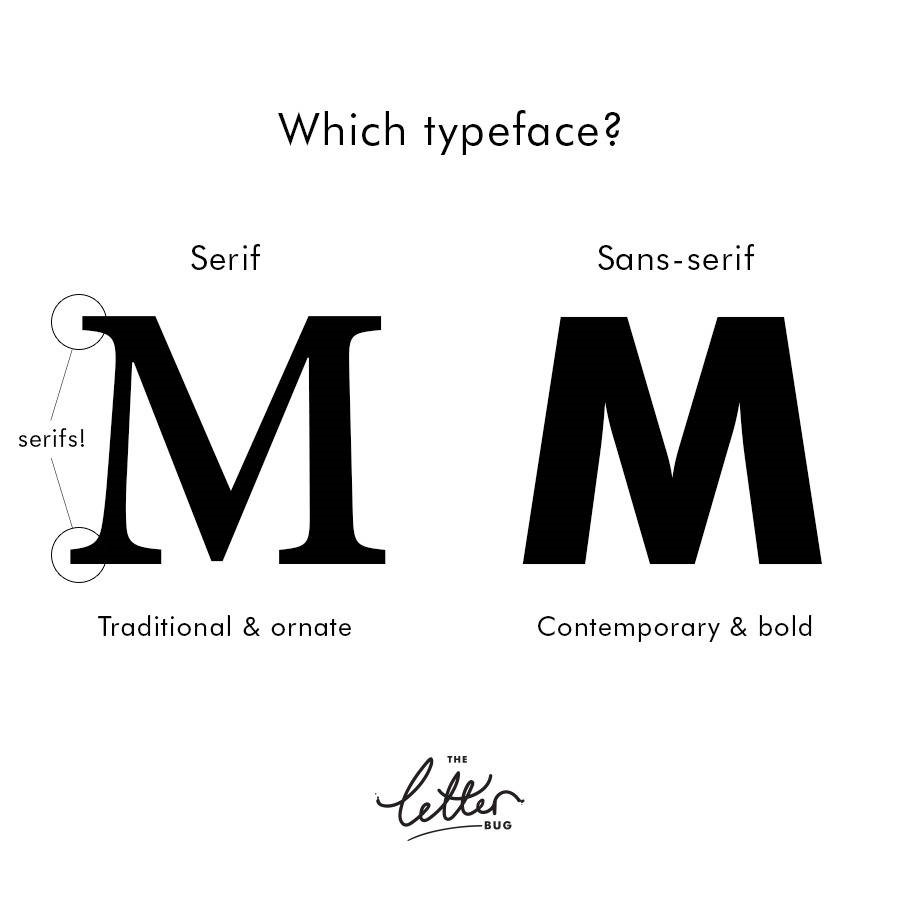
Your typeface can make a difference in not only look and feel but also usability. Although this topic can easily fill a blog by itself, let’s talk about the most basic category of font: serif and sans serif. There is a lot of debate on where to use one or the other. Some say serif fonts are for print and sans serif fonts are more digital and web. Others say it doesn’t matter. What people do agree on are the usability aspects of each font style. Serif fonts are known to help guide the eye to the next word, thereby increasing the users reading speed and decreasing eye fatigue. The serif style however is not commonly used in medical devices because of its old-fashioned look and feel. Sans serif is more readable when a small font size is used and are more child-friendly because their simplistic and recognisable form. Sans serif styles fonts are more commonly used in medical devices due to the clean, modern look and feel.
Another aspect of typefaces is font size. ANSI/AAMI HE75 details exactly how designers can calculate the exact minimal character height based on anticipated reading distance and visual angle.
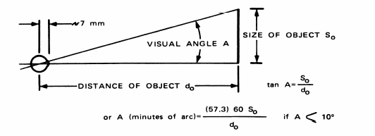
Based on the equation above, the character height (inches) = Distance (minutes of arc)/(57.3 x 60).
Staying current and consistent
It’s very rare to design anything that doesn’t already exist or have an analogous device. In the medical field, users are trained or have practiced on a specific existing model. If designing a similar device, users will expect a similar user interface design. Pay attention to similar patterns in layout and colour in analogous devices and implement them into your design.
Be careful when applying a trendy UI design style that is currently popular in the consumer industry. Trends can come and go within a year or two whereas a medical device will be in development for 2-10 years or longer and then have a product life cycle of 5-20 years. Designing a UI with a flashy trendy style will risk the device being outdated before it is even on the market.
Realism/Biomimicry/Skeuomorphism
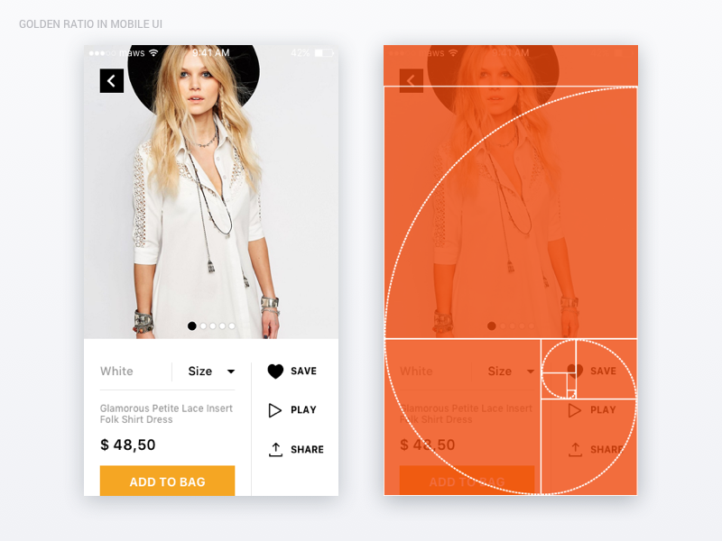
When detailing the layout or icons, here’s a golden rule that you can follow. The golden ratio. The golden ratio describes the symmetrical relationship between two proportions. It appears in nature and architecture dating back over 4000 years. Our brains have a subconscious affinity for the golden ratio and many designers have used it in user interface layouts, icons, and logos. In its decimal form, the ratio is 1.618. When designing with the golden ratio, shapes, all sizes and layouts will be proportional to each other by either a factor of 1.618 or 0.618. See image at beginning of blog.
Our eyes and brains are accustomed to the laws of physics and nature. When our eyes see something that doesn’t follow those laws, we tend to feel like the object is “off”. Somewhere around the end of 2011, a UI design style, Flat UI design, was popularized over the Skeuomorphism UI style. The Flat UI design is defined by the lack of any elements imitating the appearance of the physical world such as shadows, highlights and textures, to generate an all-digital design. Although the design was neat, it sacrificed a lot on usability.
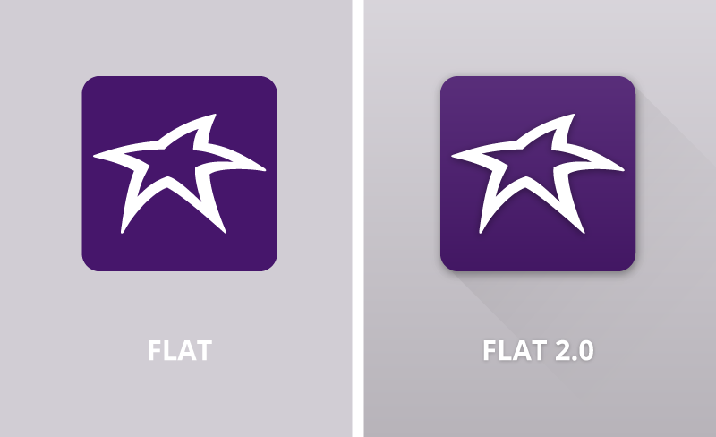
What Skeuomorphism UI style had that Flat UI design didn’t was the illusion of depth on a 2D surface which helped users interpret visual hierarchy and interactive elements. Elements that looked raised were easily interpreted as clickable and elements that provided a shadow cast over another communicated hierarchy.
Currently, the style is going back to blending the best of both worlds and introducing a new style, Flat 2.0. Flat 2.0 or Almost Flat follows the laws of physics, bringing back the shadows, highlights, gradients and textures but subtly on a flat, minimalistic element. This may sound like a trend, which goes against my previous warning, however my point is not that you should use Flat 2.0 style, but you should understand the basis behind the style and the concept of adding realism into your design.
One caveat: medical devices may carry heavy risks if any part of the system fails. Although Flat 2.0 Design may provide better usability, the minimalistic design of Flat Design means load times are much quicker and software failure is less often.
UX Design and Colour
Of course colour plays a big part in designing the user interface, including colour psychology, the human factors of colour, and colour specifications in the medical field or branding. I won’t talk too much about colour psychology as my colleague, Christine Park has written several blogs on the subject, and a quick Google lookup will give you more information. Colour can aid in creating the mood you desire. Orange provides lots of energy, blue produces a calming effect, and white space provides the feeling of cleanliness. More on colour psychology can be read in our blog, Unleashing the impact of colour in medical device design.
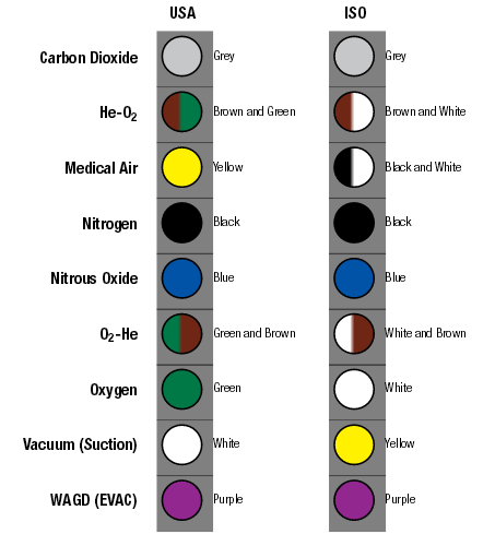
Using colour in the medical field can be a complicated task. Specific colours often have assigned meanings. For example, when working with pharmaceutical and medical gasses – grey is for carbon dioxide, blue is for nitrous oxide, and black is for nitrogen. Care is necessary when choosing colours for UI elements in order to avoid confusing users. Because of the high risks that may come as a result of use error in medical devices, choosing colours must also consider colour blindness in a percentage of users. Mitigate colour use errors by choosing colours that aren’t affected by colour blindness such as blue, or not using colours to differentiate specific UI elements.
UI design is much more than making things look pretty. The basis of medical device design decisions in UI design is usability. Although in many other fields of UI design, aesthetics may take the forefront, in medical device design, if we can’t provide a documentable reasoning behind a design decision in our UX Design besides “because it looks nice” then our device runs the risk of not passing regulatory submissions. Medical User interface design can still look pretty, but it must be pretty with a purpose.
Kimberly Nguyen is a former Industrial Designer at StarFish Medical. She works on a variety of Medical Device projects and prefers to start at the Product Definition phase. This is Kim’s first blog for StarFish.
Images: StarFish Medical
