It is important to define medical device ID strategy early, especially when form and function are often closely intertwined. This exercise is most useful once a company is ready to begin developing a tangible product. Defining your industrial design strategy can help ease some of the uncertainty that surrounds early stage product development.
The first steps to shaping your medical product’s look and feel
What is a Medical Device ID strategy document?
An ID strategy document pulls together character traits and core values of a company and attempts to condense a high level design direction in the form of a series of mood boards. These boards can help establish a feel for the aesthetics and form factor of a product.
Why is this valuable? Not everyone speaks the language of an industrial designer and not everyone on a team will be interested in mulling over curvature continuity and pantone swatches. A good ID strategy document can quickly get a large interdisciplinary team fully aligned on a product’s design direction.
An ID strategy document is created from input gathered in an ID strategy brainstorming exercise. It is ideally conducted in a room of key stakeholders including end users. Here are a few exercises to get started with your own ID strategy brainstorming session.
Thinking in metaphors
Start by establishing the personality of your brand or product. This can be done with open ended questions like “if your product was an animal, what animal would it be and why?” To push deeper and to have a little fun, ask “if your product was a celebrity, who would that celebrity be and why?” and “if your product was a movie, what movie would it be and why?” At the end of such an exercise, take the information you gathered and create a mood board of images similar to the one below. It’s meant to be vague on the details in order to give your product a persona around which to form a more detailed design language.

The simplified mood board shown in this example summarizes the metaphors and the reasoning behind them which would have been gathered during the brainstorming exercise.
Balancing opposing ideas
It helps to think in opposites to feel out where your product sits on a particular spectrum.
For example: do you want your device to look like a slick, contemporary consumer product or do you want it to look like a rugged, effective engineered product? Do you want the product to be discreet or conspicuous? For example, wearable devices can often be informed by looking to your user. Is the user someone who wants to express their individuality or are they someone who would rather blend in with the crowd?
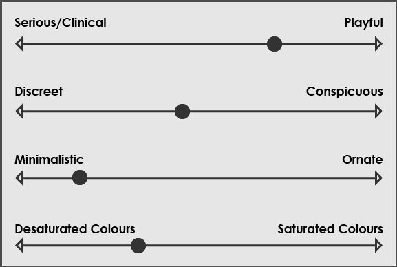
In this example, a few key characteristics are balanced on a sliding scale. The arbitrary scale still leaves it open to the interpretation of the designer.
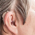
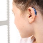
A deep understanding of your user helps determine what design direction might be appropriate. The image on the left shows a discreet design for a hearing aid while the image on the right shows one that is more expressive.
Exploring the product landscape
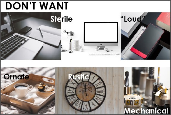
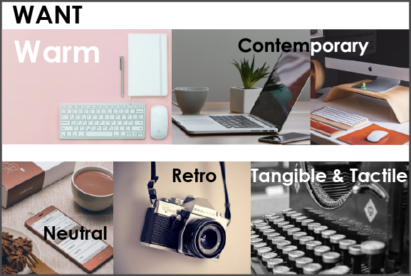
Finally, explore the product landscape by taking a look at analogous devices, devices that are similar ergonomically, and even devices that are chosen purely as aesthetic examples. In this stage it’s important to ask participants which examples resonate with them and why. The end goal of this exercise is a mood board that calls out these important characteristics.


The examples shown are two simplified mood boards for a home office product. It’s just as valuable to capture “don’t wants” from participants as it is to capture “wants”.
Things to keep in mind when compiling participant feedback
What is appropriate for the use environment? While it can be good to push the limits of what is considered acceptable in order to differentiate your product, it’s also good to understand why certain barriers exist. Industrial design in the medical field often poses some unique challenges from most consumer products. A good comparison is military products which often have a distinct rugged and camouflaged look. Medical products are similar in this way. A surgeon performing a high risk procedure probably doesn’t want a distracting neon orange heart lung machine any more than a soldier on the battlefield wants a hot pink glow in the dark assault rifle.
What’s your timeline? In medical device development, it’s not unusual for products to take several years to get from concept to finished product. Once purchased, a device could then see a service life of ten to twenty years. In cases like these, it’s important to choose an aesthetic that really stands the test of time. Rather than attempting to predict what will look trendy in the future, it’s easier to establish what won’t. Try not to commit to short lived trends in colour and form that will quickly make your product look dated.
Keeping these pointers in mind will help you summarize the huge volume of feedback from your brainstorming exercise in an intelligent way. With an id strategy document in hand, you’ll save a tremendous amount of time getting everyone on the same page and giving your design team a solid foundation on which to begin ideating.
Tim Park is a former StarFish Medical Industrial Designer based in our Toronto office. He previously worked at Kangaroo Group. His experience includes consumer and medical device products. This is his first StarFish blog accompanied by his first StarFish video.
Collage images are from pexels.com
