3 Medical UX design differences compared to consumer UX design
It is up to the medical UX designer to thoroughly research their users, environment, and product to produce a user friendly medical device. This blog focuses on 3 Medical UX design differences between the graphical user interfaces (GUI) of digital displays in medical devices and consumer products. Like consumer design, the medical field is spread far and wide, so this blog will not cover all medical device UX design differences, but these 3 are still useful to consider.
Comparison 1: Medical professionals need to make the final decision
A recent theme in consumer product design is to make everything digital or AI controlled. This helps simplify tasks by reducing the amount of human brainpower required to complete a task.

For example, June is a smart oven with a camera which it uses to recognize any food placed inside it. Without additional input, June will cook food at the correct temperature and time. You no longer have to remember, or pay attention to the cooking process of your meal. June will automatically turn off and alert you via your phone when it’s ready. Reviews have generally been very positive with rare comments that the oven sometimes incorrectly recognizes the item inside or undercook or overcooks their meal.

Wouldn’t it be great if we could transplant June’s capabilities into a medical device that can recognize someone’s illness and suggest ways to treat it? Maybe not yet. The difference between consumer devices and medical devices is that consumer devices can afford to to make errors whereas medical devices cannot. If the June smart oven mistakenly recognizes your tray of cookies as a tray of chicken wings, then the worst thing that can happen is that you end up with a tray of very burnt cookies. If a medical device mistakes a patient with the common cold as a patient with throat cancer, then you have a patient who would be put through unnecessary chemotherapy treatments. Medical professionals today still use technology to aid in their decisions but are not ready to completely trust technology to make all the final decisions. Many medical devices today provide some form of safety overrides. If the device touchscreen is malfunctioning, there’s an analog control. If the device fails to perform a task, there’s a manual procedure. And if all else fails, there’s usually a very large emergency stop button.
Comparison 2: Medical professionals don’t have time
No one in this day and age has time. But medical professionals have something more important stressing them, someone’s life on the line.
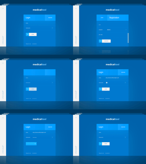
The above GIF is a result of the new trend in 2017: Motion design. It’s the motion feedback that appears when a button is tapped/pressed. Its benefit is to give users a focal point and provide a more immersive and satisfying experience. However, motion design can add extra computational weight and time and be a distraction to medical professionals if used improperly. Professionals may also be impatient if the feature is slow and distracting. The extra computational weight might increase risk of software malfunction, potentially endangering lives.

The above image illustrates motion design properly used in a medical application. The motions are minimal and just enough to provide a focal point to users. Proper use of motion design in medical devices can help increase usability, efficiency and set a design apart from competitors. Alternatively, motion design used purely for aesthetic purposes may not be viewed positively in medical device design.
Comparison 3: Medical professionals have specialized background knowledge
Just as the general population associates red with stop and green with go on a traffic light, medical devices have features and standards that professionals find familiar.
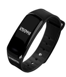
Wearable technology is the present and future of consumer products. We now have wearable fitness trackers, smart clothing, Google Glass, wearable real-time translators and more. It’s inevitable that healthcare will follow suit. Above is an image of a wearable blood pressure monitor. Its benefits include the ability to measure blood pressure anywhere at any time. However, due to the small digital interface, the design of the wearable blood pressure monitor sacrifices one small but significant feature: Familiarity.
MAYA (Most Advanced Yet Acceptable), is a design principle coined by Raymond Loewy, an industrial designer who revolutionized design in the 20th century. It’s the balance between neophobia (fear of anything new) and neophilia (love of anything novel) where products are designed to be innovative but familiar.
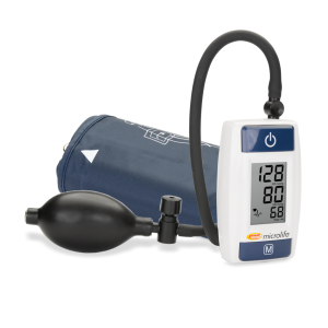
The wearable blood pressure monitor in Figure 5 is harder to read to new users because it lacks the familiar layout that all current blood pressures utilize: displaying data in a single column, in rows where the first number is the systolic pressure, the second number is the diastolic pressure and the last number is the pulse. It’s a standardized layout that allows medical practitioners to read a blood pressure monitor quickly and easily, even in a foreign language. It’s tempting to choose technology over familiarity, but usability and efficiency may get lost by that choice. In medical device design it is important to carry over standards, habits, and cues that medical professionals are familiar with to ensure that the device is intuitive and efficient.
Conclusion
These 3 Medical UX design differences don’t cover every aspect of medical device design. It is up to the UX designer to thoroughly research their users, the environment, and product, and to perform user tests in order to produce a user friendly product. It’s also wise to keep an eye out for these 3 comparisons during the development stages.
Kimberly Nguyen is a Jr. Industrial Designer at StarFish Medical. She works on a variety of Medical Device projects and prefers to start at the Product Definition phase.
