Creating reality from the intangible.
In this blog I will highlight tips and techniques to help industrial designers and human factors researchers translate user and patient insights into medical device products that address the holistic needs of users.
User centered design is collecting user insights, perceptions, needs and desires and using that information as the foundation of medical device and procedure designs. To collect information, implement qualitative research techniques including ethnography, on-site visits, environment observation, and KOL interviews.
This research provides rich information that helps us to understand targeted, specific challenges that users may have and informs a wider spectrum of perceptions and emotions that shape the larger picture of how someone interacts with an object, the overall user experience.
Findings from these efforts are often abstract. Based in emotion, experience, and not physical interaction, they tend to be intangible and do not translate directly into the tangible world of medical device design. To fully address the user experience with objective needs and desires, employ several techniques that help translating user and patient insight findings into the tangible world.
1. Use Analogies to Identify Individual Meaning
The concept of “precision” may have completely different meanings to different user groups of a device and very certainly a different meaning to the designer of that object. A patient’s interpretation of precision and how they experience it through a medical device may be an appearance of advanced technology or “high-tech” where as a physician may experience precision as the specific materials used and the durable “feel” of a device’s physical interface.
In my previous blog, I mentioned that designers must also shed perceptions and interpretations when we speak to users and cannot assign our own meanings to the terminology that we use. These differences in interpretation can be influenced by many things including the role that the user plays in interacting with the device, cultural up-bringing, socio-economic position, sex, physical health, etc.
In order to understand what “precision” means to each user, assign context to the term through analogies. Analogies (or analogous devices) can be direct, one-to-one comparisons to the product being designed, or they can be periphery comparisons; objects that share similar physical characteristics (sizing, human interactions, etc.) to that object.
What is performance? Is it speed or robustness or efficiency? Is it digital or analogue? A single term can mean very different things to different people. As designers it is important to understand what terms “mean” to the users of a device. We must shed our own interpretations to understand the users’.
Let’s say that we are designing an MRI machine. A direct comparison would be referring to the design and aesthetic of an existing MRI machine. A periphery comparison would be referring to the design, aesthetic and “feeling” of a CT scan machine (similar workflow), an interior environment (creates an emotional feeling), would be an automotive interior (high user physical interaction), as these analogies could share similar traits.
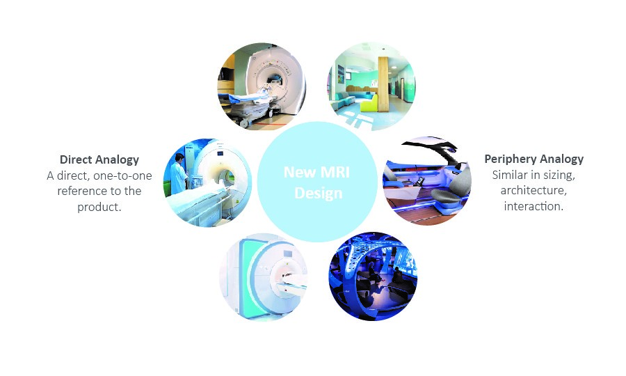
MRI with direct and periphery analogous devices. When looking for analogies, don’t be afraid to go beyond the exact device you are designing. Inspiration can come from a variety of sources.
(StarFish Created Image)
Referencing analogies can be accomplished in one of two ways. In the first example, designers and researchers could provide users with several reference images or physical products that display a spectrum or interpretation of a desired trait. For example, if “performance” is a key desired trait, designers and researchers could provide visual examples of 3-4 analogies that communicate performance differently. They could then let the user to react and choose which of the images best represents “performance” to them. Through discussion around this object designers and researchers can gain a greater clarity on how to design “performance” into the new device.
Secondly, designers and researchers could ask the users to select for themselves and provide some reference of what “performance” is to them. The user would collect images, brand references that embody performance to them, and share them with the designers and researchers . In reviewing the images they provide, discuss and identify the nuances that communicate to them.
Use analogies as a communication tool between researchers and users to gain a greater clarity and nuance of understanding. Creating clarity around what a person says and what a person means allows designers to design objects and experiences that truly hit the mark and connect with users.
2. Polarization and Experience Maps
One technique to employ during the ideation stage of the design process is polarization and experience mapping. This is taking high-level emotions or drivers that have been identified during the user research, isolating them and applying them to every aspect of a design. The result is many different ideas that exemplify the characteristic that the designer is trying to address. This framework will also help to ensure that the user’s desires are being addressed in all aspects of a device design.
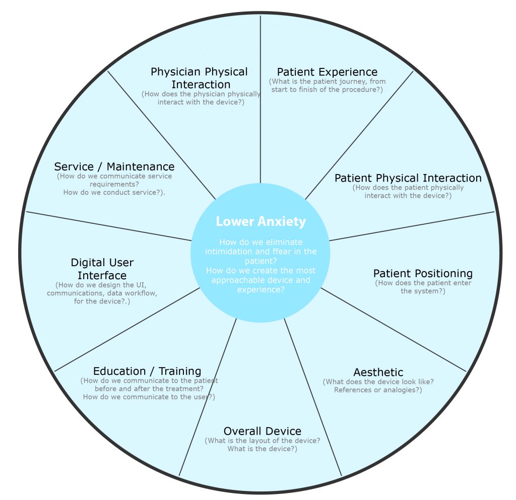
Framework for polarized Ideation | Isolating key drivers and applying them to each portion of a user experience allows for thorough and unrestrained ideation that is defined by user research.
(StarFish Created Image)
Sometimes key findings can be in direct opposition to one another. For example, if patients are typically anxious or scared of a procedure or their condition, apply some approachability and softness to the overall aesthetic and patient interface of the device. However, a different user of that device (a physician or surgeon) indicates that above all they desire durability and robustness in that same device, this characteristic may directly conflict with a soft and approachable form. Ideating around both of these drivers together can be extremely difficult to combine the two characteristics into a cohesive final design. In many cases a good idea may be discounted during ideation if it conflicts with a second driver. To further compound this challenge, there would never be only two key drivers for a medical device. Typically 5-6 key drivers could be competing.
Medical devices and the interactions people have with them are very complex. Most devices will have an overall aesthetic, several interaction points, communications / educational material, cleaning and maintenance needs, potentially a digital interface… and this list can go on and on. The sum of all these parts is the user experience of the device. Consider that a device may have 15+ individual key interactions with its users and users may have 6+ key drivers that colour each interaction with that device. It can become overwhelming to ensure that everything has been addressed.
After completing the individual ideations centered around polarized drivers, there will be a plethora of ideas across the entire user experience of the device. At this point, begin to combine small ideas from each framework with small ideas from other frameworks into complete conceptual designs. Polarized concepts will provide many small ideas or ingredients that can be assembled to create larger, more holistic designs or recipes. Taking some ideas from each ideation map can ensure that the needs of all users, across the entire user experience are addressed in a cohesive, nuanced and impactful design.
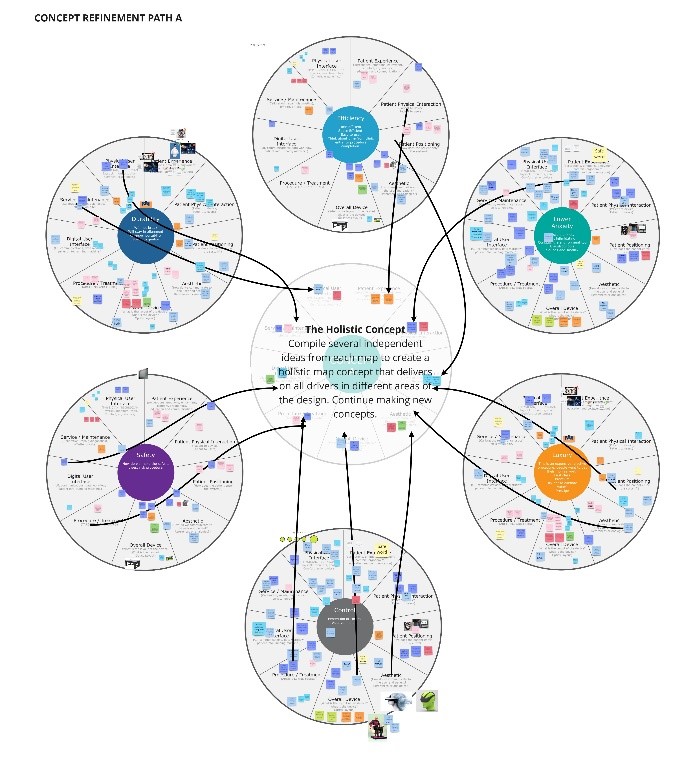
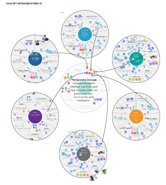
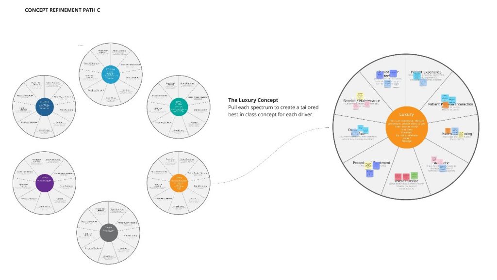
Polarized Ideation | Once polarized ideation has taken place, there are several ways that you can pull together the ingredients to make a recipe.
(StarFish Created Image)
Translating user and patient insight
Industrial designers and human factors engineers can collect concise and impactful insight from users and translate those emotions and needs into tangible medical device concepts. These techniques focus primarily on the research and ideation phases of the design process. It is important to remember to continue involving the user as the design process progresses. In future blogs I hope to provide tips and techniques for collaborative creating and user validation that will help ensure new conceptual designs are hitting the mark.
Mike Loveless is an Industrial Designer at StarFish Medical. Based in Toronto, Mike studied Industrial Design at Humber College and has 15 years experience in consumer product design working both freelance and with full service design firms. Translating user and patient insight is part of a series of blogs with tips, tricks and nuanced techniques that Mike has learned in conducting qualitative user research.
