Unleashing the impact of colour in medical device design: trends and branding
For almost a century, green was the colour of hospitals and medical devices. That’s because back in 1914, according to a fascinating story in the Canadian Medical Journal, US surgeon Dr. Harry Sherman found the traditional white background much too bright and glaring under the new electric lighting systems.
Reasoning that green was the colour complement of red hemoglobin, Sherman’s experiments with all green in the operating room found it provided superior ability to see anatomical details with less tiring. Coupled with research finding green had calming qualities for patients, hospitals usage of green became the norm for many years to come. These days, while green is starting to phase out in hospitals, colour is still important. That’s because colour imparts distinctive cues and functional qualities to a medical device.
During my employment at Belkin, I had the opportunity to work closely with CMF (color, material, and finish or sometimes known as color, material, and trend forecasting) specialists to create CMF solutions for iPod/iPhone accessories. The impact is incredible. I now apply that knowledge to colour in medical device designs. Over a three-part blog series I will explore multiple aspects of colour design including trends and branding, functionality and emotional connection, and a process to help determine the best colours for your medical device.
Trends – Colour can make a product look “current” or “out-of-date”
Colour trend in consumer product industry impacts colour choices for medical products. Using popular colours makes products seem current and up-to-date rather than dated. For some medical devices high tech aspects are the main features of the device. The psychological effect of using the “latest and greatest” applies to users of medical devices as it does with high tech consumer electronics. Colour is one of the first cues to telling the user whether it is up-to date or out-of-date. Be mindful, however, of choosing unusually trendy colours especially if the product’s lifespan is relatively long. Today’s hip colour can make a product seem out-of-date after as little as one year.
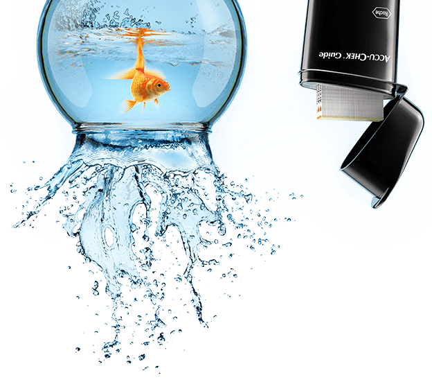
In the recent years, many medical products that were once used in hospitals and clinics are making their way into homes. Patients’ and consumers’ demands on medical devices are growing and becoming more sophisticated. Medical products placed in residential environments need to have similar aesthetic appeal as consumer products. Colour is one of the key features in appealing to consumers and should reflect users’ lifestyles. Historically and currently, medical products have used blues and greens because these are seen as calming colours. Medical device companies are starting to take colour inspiration from big consumer brands. For example, in the past Accu-chek have primarily used blues and whites on their blood sugar monitor devices. Now, they primarily use black. The sleek form, finishing, and colour make it look more like a high tech consumer electronic product rather than a healthcare product.
In the past, for large products used in clinics or hospitals, such as ultrasound systems, beige used to be a popular neutral colour. Large hospital-based devices require greater area of neutral colour so they do not overpower the environment they are used in and have a look that encourages them to be kept clean. . Currently, beige is less popular because light greys convey a stronger association with high-tech, a feature many companies want to promote.
Staying in tune with current colour trend adds value to your products. To add value to your company using colour, develop a unique colour palette (that is aligned with current colour trend, of course). It can have a tremendous effect on establishing your company’s brand identity.
Brand Identity – Colour can be used to distinguish a brand

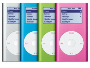
Do you remember a time when all laptops were black? Apple went the complete opposite direction and created white laptops. Then, they did the unthinkable and produced a silver (aluminum) laptop with their MacBook Pro. Next, they shocked the world once again by introducing bright colours to the electronics market with their colourful iPod Minis. Even from a far distance, you were able to distinguish an Apple product just from their colour. They were one of the first companies that successfully distinguished their brand from everyone else by employing a smart strategy of colour design.

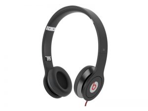
Another good example of usage of colour in establishing a brand identity is Beats by Dr. Dre’s strategy of implementing red as an accent colour across their product line. By the time a new company called Beats by Dr. Dre entered the headphones market in 2006, all the companies in that industry were busy jumping on the bandwagon of copying Apple’s white earbuds. During that time, if you were standing in front of the headphone/earphone aisle at BestBuy, you were limited to seeing either white or black. Beats by Dr. Dre dared to pass on the bandwagon carrying all the Apple copycats and used the opportunity to distinguish its brand by introducing a combination of red and black to the headphone/earphone aisle that was beckoning for some colour. Beats’ strategy of colouring all their cords red, along with aggressive marketing, helped them gain 64% of market share in the U.S. for headphones priced higher than $100 by 2012.
Logos are a great way to establish brand recognition. But from a distance logos become unidentifiable. Colours are recognizable up close and from a far. Consumer product companies are realizing the potential colour has in achieving branding recognition and are applying them in successful ways. It is a great time for medical device companies to abandon the predominant colour schemes of neutrals and pastel colours and experiment with bolder colours to distinguish themselves.
In the next blog article I will explore how colour in medical device design can influence functionality and emotional connection. In the meantime, I’d enjoy hearing from readers about their experiences applying colour to impact medical devices.
Christine Park is a former Industrial Designer at StarFish Medical where she used her knowledge of colour, material, and finish to design innovative medical devices for clients.
Lead image: accu-chek.ca
IPod Image: Apple
Headset Image: Beats
