Unleashing the colour impact of medical device design: usability
Colours make products easier and more intuitive to use
Staying with the current colour trends and creating your company’s colour palette can create more acceptance for a medical device as explained in my previous blog.
Colour can also enhance usability through organization and eye orientation. The right colours can diminish negative feelings often associated with the need to use a medical device. In this blog, we will explore how colour in medical device design is used to increase usability and influence user/patient emotional response.

Eye flow/direction
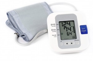
Colour directs the eye through a hierarchy of information. It is useful on devices that require multiple steps. Contrast naturally attracts attention. On the blood pressure monitor at the top of this blog, a highly saturated blue against a white instantly directs the user’s eye orientation to the “start” button.
Next, the user’s eye orientation is guided to the grey box (containing the buttons and the display screen) and it rests there.

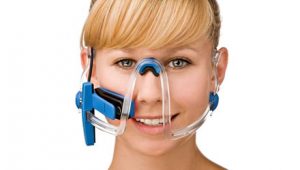
Another example with similar color scheme is the OsseoPulse, a project Starfish Medical worked on few years ago. Once again, the use of saturated blue against the white background creates contrast and brings the user attention to the control buttons. The logo, display, and buttons are placed closely together and rest of the surface is left empty. It retains the user’s focus where it needs to remain. In addition, the use of darker color around the device helps keep the eye direction from wandering off the device and remain inward. The darker color also acts as a border that defines the outline of the device. If there wasn’t a dark border, the device would blend with the color of the counter-top it rests on.
Colour coding

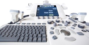
Colour can categorize or group related functions, providing a system of organization. It can define different areas of function and importance. For example, the interactive components of this Ultrasound machine by GE Healthcare are well organized by placement and use of different tones of blue and grey. Coloured buttons and knobs that the user interacts with are immediately highlighted against the white background due to contrast. The metallic grey trackball does not share its colour with any other buttons or knobs. Its unique colour signifies a unique function to the user. Light grey buttons surround and support the function of the trackball.
These are surrounded by a group of tinted blue buttons. And around them, are a group of darker blue buttons and knobs used for colour impact in medical device design. The difference in the shade of blue separates the buttons and knobs into two groups signalling that the buttons and knobs in the darker blue group are used more frequently or hold higher importance. The keyboard is also neatly tied together with a colour.
Cleanliness
A functional reason for using white, light gray or light neutral colours for colour impact in medical device design is because dirt and smudges will contrast against the light background. Such colour contrasts make it easier to see whether the product has been cleaned thoroughly and encourages staff to keep them clean.
Dark colours conceal dirt, which is why most casters you see are in dark colours. For the same reason, dark colours are applied around the base of floor-standing products, control surfaces, handlebars on pushcarts, and any other areas that have a tendency to get dirty due to frequent use. On the ultrasound machine, the probe holders are in a darker tone of blue. Not only does this colour impact medical device design, the contrast helps the user locate the holder quickly after using the probe, but the darker colour also helps hide scratches and scuff marks.
Influencing the patient/user’s emotional response
Hue: what we usually refer to as “colours”

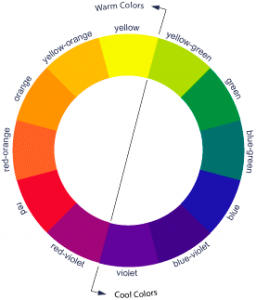
Colours from yellow-green to violet are considered cool colours. Considered to be more passive than warm colours and associated with cool temperatures and relaxation, they are popular in hospital settings and the colour impact of medical device design for their calming quality. Colours from yellow to red-violet are warm. Warm colours are energetic and happy, and therefore good for rehabilitation uses. Yellow, in addition to being energetic and happy, carries youthful characteristics, which is why it’s used widely for paediatric devices. Warm colours are also good for devices that are cold to touch because the psychological impression of warm colours can alleviate the cold sensation.
Saturation: colour’s intensity
Highly saturated hues will be bold. Less saturated hues are soft. Pastel colours have low saturation. They have been widely used in hospital environments to reduce the stress of patients. High saturation can be energetic or alarming. Used against a light background, they are great for grabbing the user’s attention and for warning signs.
Value: brightness of a colour
A difference in value also creates contrast, which is another way to draw attention. In addition, darker (low value) colours look heavier and give the emotional response of being secure and anchored. If used at the base of a machine or device it suggests that it is sturdy and well anchored. It also implies characteristics of seriousness. Lighter (high value) colours signify cleanliness and purity. They seem lighter in weight. This makes them a popular choice for large medical machines so they do not overpower the spaces they occupy.
Now that we understand how the colour impact of medical device design affects usability, I’ll share an example of how to develop your own process for choosing the right colour for your device in the final blog of this series.
Christine Park is an Industrial Designer at StarFish Medical where she uses her knowledge of colour, material, and finish to design innovative medical devices for clients. She wrote this blog during her vacation showing attention to commitments as well as her eye for visual impact.
Lead Image: www.istockphoto.com
Colour Wheel: https://hopeasfro.blog/
